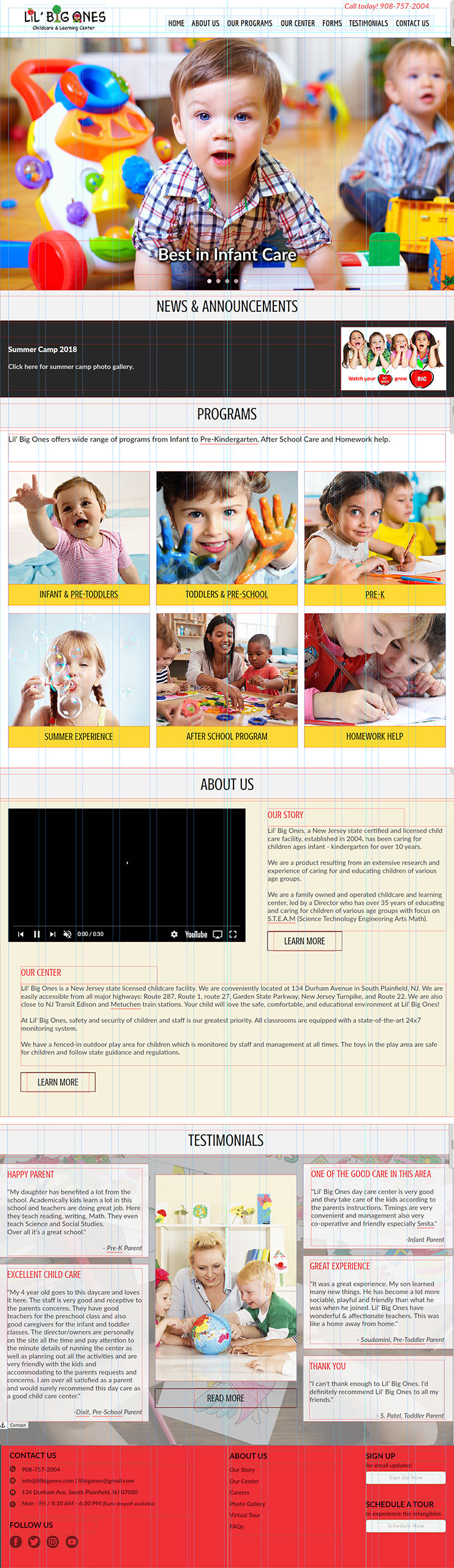
Lil’ Big Ones is a New Jersey state certified and licensed child care facility, located in South Plainfield, NJ, has been caring for children ages infant - kindergarten for over 10 years. Lil’ Big Ones is a product resulting from an extensive research and experience of caring for and educating children of various age groups.
PROJECT BRIEF
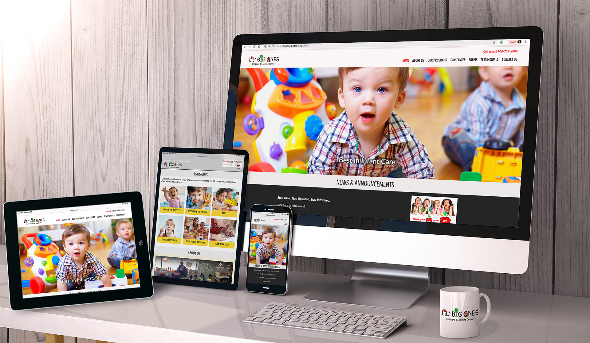
As there was strong business need to re-design the website for clean look, clear content, simple navigation and aesthetic design. The new website has built using mobile first design approach. The goal was to provide an optimal viewing experience for all users, no matter what type of device they are using.
BUSINESS GOAL
The purpose of this project is to develop a responsive website that works seamlessly across multiple devices. The goal was to create a site with minimal content, easy navigation, and minimum pages/clicks to make the experience more continuous and fluid for the user.
UNDERSTANDING THE TARGET AUDIENCE
DESIGN CHALLENGE
USER GOAL
The site should have all important information on home page with minimum dropdown menus to have the best possible experience to the users on all screen sizes.
User Research - Interviews and Questionnaire
Users for this site are mostly parents looking to enroll their child or to find information about the facility. My role in this project was to understand what users want to see the most on this website. A formal list of questionnaire was prepared and the respondents were asked questions on their demographic interest opinion. The focus was to target the parents with children under 6 years old.
How do you hear about us?
Have you visited our facility? If yes, how do you feel about it in terms of accessibility?
What do you like the most about our center?
Have you visited our website? If yes, what do you like about our current website?
What features you would like to have in the new website?
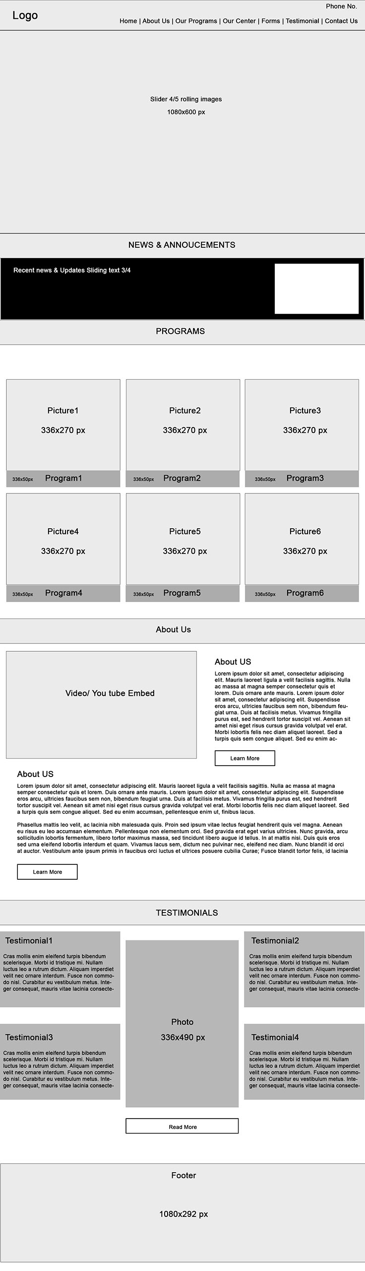
DESIGNING WIREFRAMES AND MOCKUPS
I have designed wireframes and UI mock-up using mobile first approach which helped us prioritize site elements while putting us in a good mindset for thinking about what content is most relevant to the site visitor and how content becomes available to work with on wider screens.
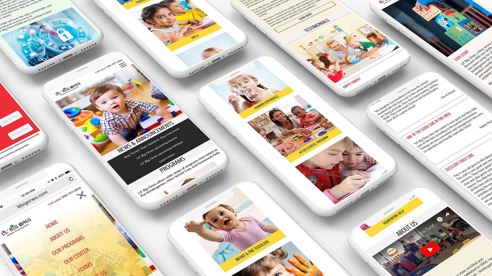
I translated user needs and business requirements into features and functionality for desktop, web and mobile experiences and designed an engaging solution for a variety of screen sizes. I was solely responsible for designing this website from concept to actual launch. I have designed the website using Adobe Photoshop and developed the website using Adobe Muse and Adobe Dreamweaver.